Overview
Introduction
Avito is Morocco largest platform for online classified ads. Launched in 2O12, Avito has seen spectacular growth and built a strong brand. As of today, Avito leads the Moroccan market with over 6 million monthly users that use the platform to buy and sell.
Context
This project deals with improving the flow of ad insert on Avito’s app on the cars vertical. The objective is to create a smooth and quick ad insert experience for car sellers by reducing the time & effort required to fill the insertion form.
Key Points
We conducted a user survey to determine if users would be able to identify their car version, as well as its importance for the selling experience. We found that the majority of users think this information is important to have on their listing; however, over 60% do not know where to get it from.
We performed a usability test with users to examine how they will feel about being automatically transitioned to the next field when filling a form. Users felt that flow is very intuitive and allowed to finish filling the form very quickly.
My role
Conducting user research
UI Design
Prototyping and User Testing
Discovery
Using the Lean UX approach, we executed the discovery of this topic alongside the stakeholders. We set a weekly meeting and collaborated using Miro. This allowed us to have inputs from different perspectives, e.g, sales, marketing, client service...
Research
Using the Lean UX Framework, we were to identify our riskiest assumptions and the research methods required to validate them.
Risk 1
In order to leverage our partnership with Largus and reduce the number of fields required by our users, we needed to introduce a new field (Car Version) that will help us achieve this goal. We assumed that the version of a car is something that our users would not be able to identify. For that, we decided to conduct a customer survey.
Risk 2
To make the process of filling the long car insertion form easier and more intuitive, the solution is to automatically transition the user to the next field they needed to fill without having to click on it. In order to understand how users think and feel about being automatically transitioned to the next input, we decided to perform a usability test.
Customer Survey
As mentioned above, we launched a survey to learn more about:
Users knowledge about car versions
The ability to identify ones car version
The importance of a car version for selling
User Segment
Android App Users who listed car ads in the last 3 months
Findings
We asked an aided question to clarify what we mean by a car version. Almost 60% of respondents do not know their car version, which helped confirm our first assumption.
Through this question, we tried to know if users know where to find information about their car version. We realized that we need to provide this information since more 65% of respondents do not know where to find it.
This question tries to determine the extent to which users think a car version is important for their selling experience. 37% think its highly important, while only 8% think it has no importance.
User Flow
In order for us to achieve an experience where users are automatically transitioned to the next field, we decided to do a few updates on the insertion flow. As opposite to what we had, which is a page containing all the required fields, we split the form into 2 main sections. The first contains only select fields and the later containing input fields where there is a need to use a keyboard.
Usability Test
Our objective behind performing this usability test is to:
Learn more about the goals and behaviors of car sellers
Users’ ability to navigate through the new flow
The thoughts and behaviors of users on the versions field page
Participants
5 participants who bought and sold cars online and who have different levels of experience using our app (First time users VS. Regular users).
Screenshots from a few usability tests 📸
Learnings
After performing the 1st usability test, we learned that we needed to adapt our portfolio to each of the participants cars to get relevant feedback. So
The new insertion flow matches the users’ mental model.
Users liked the automatic transition. A user described it as “Butter Smooth“
Users thought the name of the versions was too technical
Users were confused by the versions names and didn’t notice the informational hint
Design
With all the insights and feedbacks collected in the research phase, we started making updates to the design to further enhance the experience.
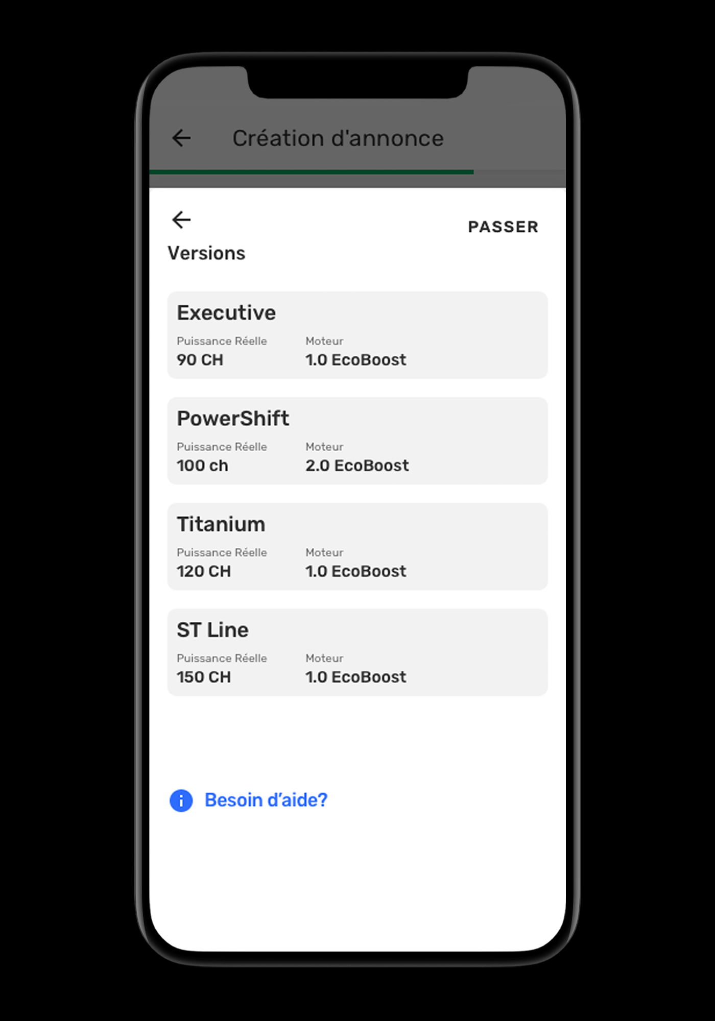
The most obvious improvement is making the version selection more user friendly. For that we divided the name into separate chunks (Trim line, Horse Power, and Engine Type).
We’ve moved the skip option to the top of the bottom sheet to increase its visibility
The hint can be accessed when users need it by taping the blue link at the bottom
Mirco-interaction
In order to further improve the navigation experience in our automatic transition flow, we decided to create micro interactions
Improve navigation experience. These also help to provide our users with instant and relevant feedback about the completed action.
We then created a detailed flow of the interactions of the components, in order to make sure every case is handled properly, and so that the developers have all the specifications they need to start the architecture.


